Clean and clear, the visual identity for the Independent Journalism Center (CJI, in Romanian) has the purpose of communicating transparent and unbiased journalistic principles. Therefore a simple, yet strong identity was created to encompass and reflect their values and beliefs in an independent, professional and democratic press.
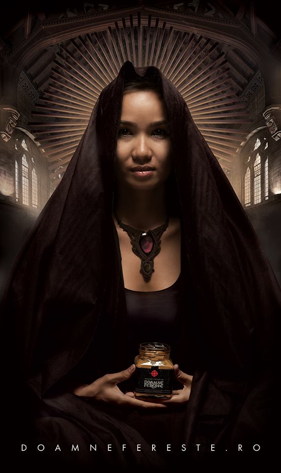
Until Doamne Fereste became the first fusion spicy sauce in Romania, there wasn’t much competition in this segment of the market, for its combination of flavors came not from studying the market itself but from observing what was missing from the picture. Doamne Fereste and its products are the result of the right amount of culinary education gathered from many parts of this world and put together with a lot of passion for great taste and visual communication.
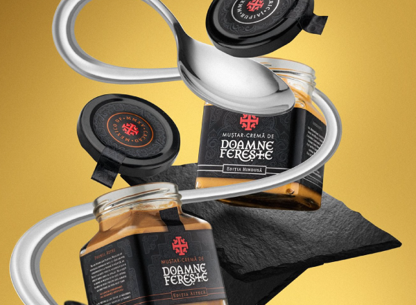
The visual identity and packaging of Doamne Fereste mustard tells a different story every time. The fusion concept found in the recipe was transformed into visual representations of the culture it illustrates. For example, The Aztec edition of the Doamne Fereste cream-mustard contains a synthesis of symbols and embellishments found in the Aztec culture. On the other hand, The Hindu edition, the first from the soon-to-be three part series of cream-mustard, represents a summary of both gustatory and visual elements of the Hindu culture.
Our mustard jars have become a statement of the brand, the cube shape being a continuation of the square-ish logo, alongside with the Aztec/Hindu elements we combined on their labels.
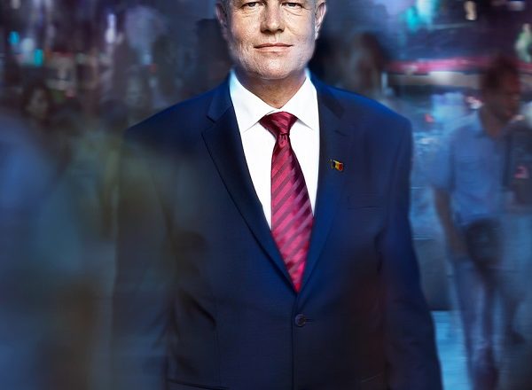
We delivered the creative vision for the political campaign of the president of Romania, Klaus Iohannis. For the first time, a Romanian politician reached 1,000,000 likes on Facebook, and the online component of the campaign helped swing the vote.
This is our super-president.
We started by defining the brand values, the cornerstones of any efficient brand communication. Klaus Iohannis is a person that stands for integrity, performance, objectivity, justice and above all, truth – core components of the brand we were about to create. We continued by picking a meaningful blue, then setting up an entire color scheme and finally deciding on FF Meta as the official font, due to its high legibility.
With our concepts in one hand and the newly created brand book in the other, we met the amazing photographers of the Greenmind team.
You can read more about our process and journey with President Klaus Iohannis here.
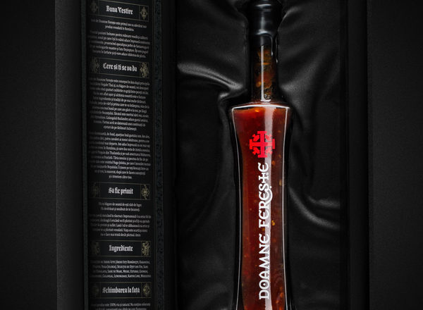
Doamne Fereste is one of our own projects, a fun way of manifesting our thirst for the spicy side of life and our passion for international fine cuisine. This is how the hottest sauce ever made in Romania was born, the first of a fusion food collection with an attitude that we hope to keep growing with time.
Although it started eventually manifesting itself, Romania’s gourmet food scene is still young and weak. We saw it as an agency and felt it as end users, so we decided to join the pioneers and test the tastes, to see what happens. We figured we either heat/ hit the jackpot or got ourselves a lifetime stash of hot sauce. This second scenario seems to be long gone, since the first batch turned out to be a success. It seems we will move forward on this spice trail for a while.
And so, we created a travel and cuisine blog and a website containing a massive collection of funny pictures (back then), to back up our product and ensure fast spreading of the news. Social media was not forgotten, and soon a community started to grow. In naming, branding, promoting, and designing the package and promotional materials, we proved to be the ideal clients. We were quite patient, kind and knew exactly what we wanted.
But all that was the fun side. Choosing the right hot peppers from three different countries was the actual challenge. Fortunately we did and we proudly dare you to taste the results!
P.S. Don’t forget to get a taste of the mustard here.
A learning hub with a vision and a long-term strategy, Robinson was created to reflect the professionalism and dedication towards educational development and to position itself as a leading entity in the field through a well-established and weighty visual and verbal identity.
DialogON is an initiative started by the Romanian Debate, Elocution & Rhetoric Association, with the purpose of generating a grounded and constructive culture of discussion that would bring people together, working towards a common purpose, rather than dividing them through frustration and misunderstandings.
Rubik Hub is a business and co-working hub focused on the start-up community. Together, we collaborated on the naming to come up with the perfect one for the brand. We created the visual identity including the logo, implementations and brandbook. The strategy was also delivered by Argo.
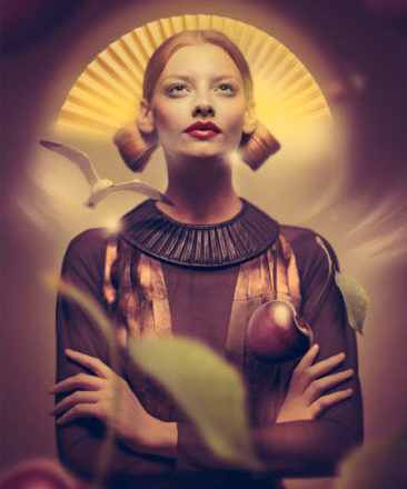
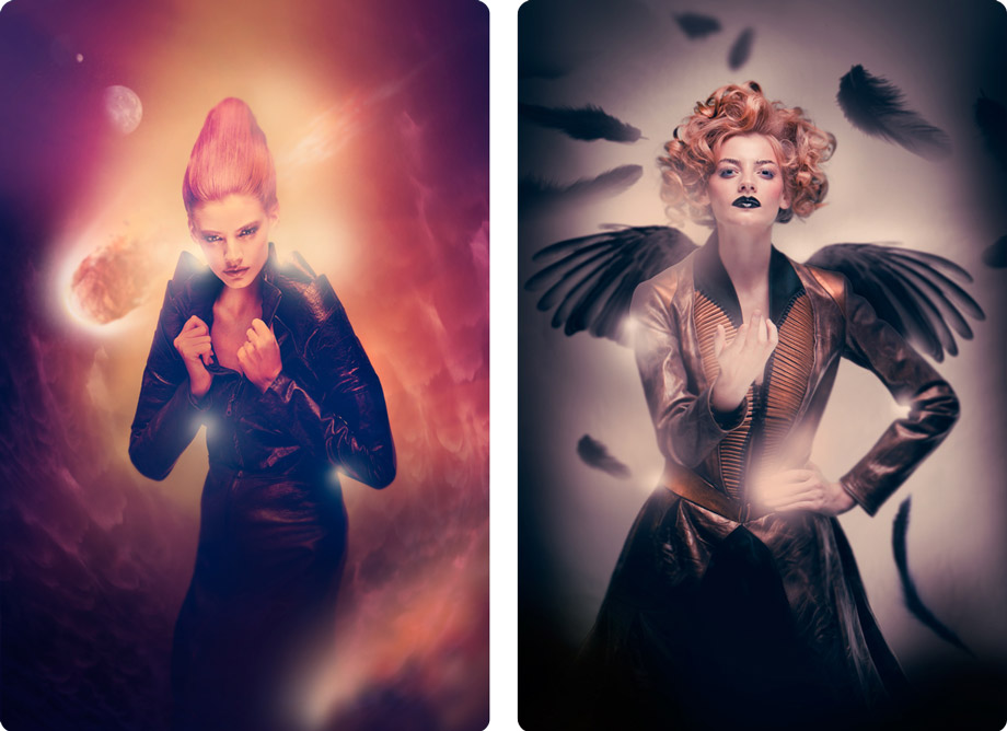
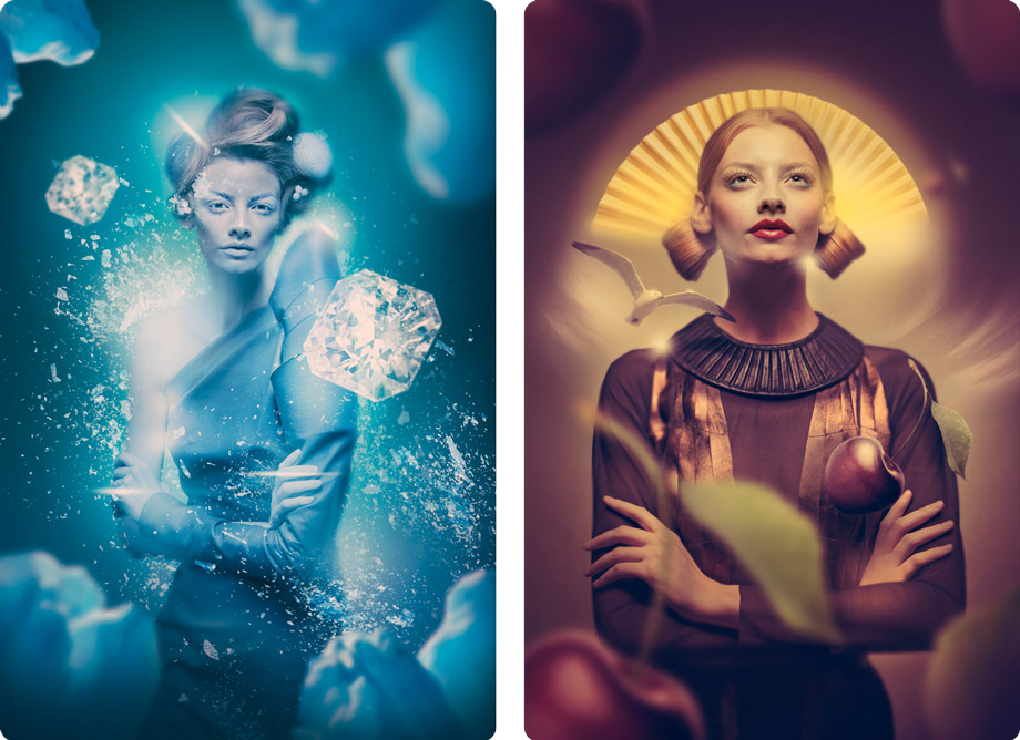
The story of the year 2013 was one of celestial seasons and alchemy symbols for The Jack, one of our dearest clients. Fire, Water, Air and Earth, the 12 zodiac signs and over 30 delivery pizzas were summoned for the 3-day shoot. Coffee kept flowing together with tears, as ashtrays and computer mice were overused for the next 7 days and endless post-production nights.
Helping beautiful things take shape and color is great, but far from simple. Fortunately, there is an easy way to do it: working with beautiful and creative people does the trick!
Our story would have been quite different without the charismatic looks of international modelIrina Magda, the decadent touch of Anca & Silvia Negulescu`sstunning collection, the electronic eye of Sebatian Tiplea and Vlad Carp, the always magical touch and brush arsenal of and Luciana Sasu or the inspired curls and combs of Razvan Miron.
An extra huge Thank you goes to Dragos Manzateanu for his incredible support and, of course, to our client, for trusting us dream in colors once again.
Our agency provided the brand identity and the campaigns materials for Baia Mare’s candidacy for the title of European Capital of Culture. The unlikely candidate was shortlisted and the city received unprecedented national and regional media coverage.
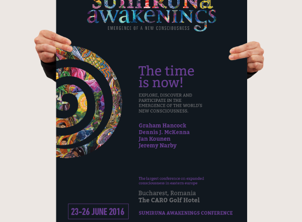
As 2016 was a year of change, the Sumiruna Awakenings identity had to encompass the diversity of their conceptual event on expanded consciousness. For the first event of this kind in Romania, Argo created a rather visionary identity that remains a statement for its next editions.